


Why Mobile-First Design Wins in 2026: A Practical Guide
- Pawan Samarakoon
- 4 days ago
- 9 min read

TL;DR:
Mobile-first design starts with creating websites optimized for small screens, emphasizing content priority and performance. It improves user experience, SEO rankings, and conversion rates by focusing on mobile device constraints from the start. Proper implementation involves content inventory, breakpoint planning, testing on real devices, and continuous enhancement for larger screens.
Mobile-first design is the practice of building websites starting with the smallest screen size, then scaling up to larger devices. This approach forces clarity from the start. It strips away everything that does not serve the user, leaving only what matters. Why mobile-first design has become the default standard is simple: over 70% of web traffic now comes from mobile devices, and designing for anything else first means designing for the minority. Luke Wroblewski coined the term in 2009, and Google’s mobile-first indexing has since made it a business requirement, not just a design preference.
What are the core principles of mobile-first design?
Mobile-first design is a constraint-driven discipline. The 375px baseline constraint forces designers to eliminate clutter and focus on content hierarchy from the very beginning. That discipline carries over to every screen size, producing cleaner interfaces across the board.
The core principles break down like this:
Content prioritization. Decide what users need most. Put that first. Everything else is secondary.
Touch-friendly interactions. Buttons, links, and form fields must be large enough for fingers, not mouse cursors. The minimum tap target size recommended by Google is 48x48 pixels.
Progressive enhancement. Start with a solid baseline experience for mobile, then layer in richer features for tablets and desktops. This is the opposite of graceful degradation, which starts big and strips down.
Performance by default. Mobile networks are slower and less reliable than broadband. Designing for mobile first means loading only necessary assets from the start.
Accessibility. Mobile users include people with visual impairments using screen readers, people in bright sunlight, and people with limited dexterity. Designing for these constraints produces better experiences for everyone.
Pro Tip: When starting a new project, write out a content inventory before touching any design tool. List every element you want on the page, then cut anything that does not serve the primary user goal. What remains is your mobile baseline.
Progressive enhancement aligns naturally with this approach. You build the essential experience first, then add complexity only where the device and network can support it. This produces leaner, more predictable stylesheets that are far easier to maintain over time.
Why does mobile-first design matter for business and user experience?
The business case for a mobile-first approach is direct. 53% of users abandon a website that takes more than 3 seconds to load on mobile. That is not a bounce rate problem. That is a revenue problem.
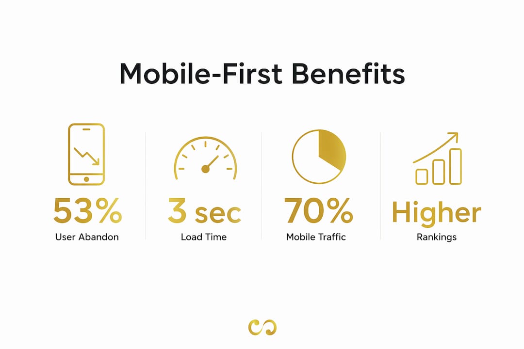
Mobile-first design addresses this by creating leaner codebases that load faster on constrained networks. The performance gains are real and measurable. Faster pages mean more users stay, more users engage, and more users convert. You can read more about the relationship between speed and results in this breakdown of faster website speed and its effect on SEO and conversions.
The UX benefits go beyond speed:
Thumb-zone optimization increases mobile engagement. Designing for thumb accessibility increases mobile engagement by 28%. That means placing primary actions within easy reach of a user’s thumb, not buried in corners.
SEO rankings improve. Google’s mobile-first indexing uses the mobile version of your site to determine search rankings. A site that performs poorly on mobile ranks lower, regardless of how good the desktop version looks.
Conversion rates rise. A site built for mobile users from the start removes friction at every step of the purchase or inquiry process. Fewer taps, faster loads, and clearer calls to action all contribute. See how this plays out in practice with this guide on designing for conversions.
Customer satisfaction increases. Users who get what they need quickly on mobile return. Users who struggle leave and do not come back.
The importance of mobile-first is not theoretical. It shows up directly in traffic, rankings, and revenue.
How does mobile-first design differ technically from desktop-first design?
The technical difference between mobile-first and desktop-first comes down to one thing: where you start and how you write your CSS media queries.

Desktop-first design starts with a full-width layout and uses max-width media queries to shrink the design for smaller screens. Mobile-first design starts with a minimal layout and uses min-width media queries to add complexity as the screen gets larger. That single difference has significant consequences for code quality and maintainability.
Mobile-first CSS uses min-width media queries to add complexity progressively. Desktop-first approaches use max-width overrides, which create specificity conflicts as the stylesheet grows. In large codebases, those conflicts become expensive bugs.
The performance difference is equally significant. Desktop-first designs often load large images and heavy assets by default, then attempt to hide them on mobile with CSS. The problem is that CSS display: none hides elements visually but still downloads them. Mobile-first design loads only necessary assets on mobile, so users on slow networks are not downloading content they never see.
Pro Tip: If you are inheriting a desktop-first codebase and want to shift toward mobile-first, start by auditing your media queries. Replace max-width overrides with min-width additions where possible, and refactor one component at a time rather than attempting a full rewrite.
Progressive enhancement is the methodology that ties this together. You write base styles for mobile, then use min-width breakpoints to enhance the layout for tablets and desktops. The result is a stylesheet that reads logically from simple to complex, rather than one that fights itself at every breakpoint.
What common pitfalls should you avoid with mobile-first design?
Mobile-first design fails when teams treat it as a checklist rather than a discipline. The most common mistakes are predictable, and they are all avoidable.
Treating mobile constraints as universal. The goal of mobile-first is to start with constraints, not to stay within them. A site that looks identical on a phone and a 27-inch monitor has failed its desktop users. Progressive enhancement means you must actually enhance the experience for larger screens.
Neglecting tablet breakpoints. Ignoring tablet-specific designs leads to phone layouts that simply stretch or desktop layouts that ignore touch users entirely. Tablets need their own breakpoints and touch-friendly UI patterns. This is one of the most overlooked gaps in mobile-first implementations.
Shrinking desktop content instead of rethinking it. Mobile-first requires a content strategy overhaul. Simply taking a desktop page and making it smaller produces poor UX. The content itself must be prioritized, reordered, and sometimes rewritten for mobile users.
Skipping real device testing. Emulators in browser developer tools are useful for quick checks, but they do not replicate real device behavior. Touch response, font rendering, and network conditions all differ on actual hardware. Test on real phones and tablets before launch.
Mixing mobile-first and desktop-first CSS. Mixing these approaches causes time-consuming bugs due to conflicting media queries and specificity issues. Pick one approach and apply it consistently across the entire project.
How do you apply mobile-first design principles effectively?
Applying a mobile-first approach well requires a clear process. Here is how to do it right from the start.
Inventory and prioritize your content. List every piece of content and functionality the page needs. Rank each item by user importance. The top items form your mobile baseline. Everything else gets added at larger breakpoints.
Design the smallest breakpoint first. Start at 375px or 320px. Lay out only what made the cut in your content inventory. Resist the urge to add elements “just in case.” If it is not needed on mobile, question whether it is needed at all.
Apply progressive enhancement at each breakpoint. Move up through your breakpoints, typically 768px for tablets and 1024px or 1280px for desktops. At each step, ask what additional content, layout complexity, or interaction patterns the larger screen can support.
Optimize for thumb-zone navigation. Place primary navigation and calls to action within the natural reach of a user’s thumb. The bottom third of a phone screen is the most accessible zone. The top corners are the hardest to reach.
Test on real devices at every stage. Use actual phones and tablets, not just browser emulators. Test on both iOS and Android. Test on older devices with slower processors to catch performance issues early.
Align with Google’s mobile-first indexing requirements. Make sure your mobile version contains the same content as your desktop version. Google indexes the mobile version first. If your mobile site hides content that appears on desktop, that content may not rank. Pair this with solid mobile optimization practices to cover all your SEO bases.
Pro Tip: Use Chrome DevTools’ Lighthouse audit specifically on your mobile configuration before launch. It surfaces performance, accessibility, and SEO issues that are easy to miss during development.
Effective mobile-first design involves inventorying content, designing smallest breakpoints first, and testing across real devices. Teams that follow this process consistently produce faster, more usable sites that perform better in search.
Key Takeaways
Mobile-first design is the most effective approach for building websites that perform well in search, load fast on constrained networks, and convert users across all device types.
Point | Details |
Start with the smallest screen | Design at 375px first to force content prioritization and eliminate clutter from the start. |
Use min-width media queries | Mobile-first CSS adds complexity progressively, avoiding the specificity conflicts of desktop-first overrides. |
Google indexes mobile first | Sites not optimized for mobile risk lower search rankings regardless of desktop performance. |
Test on real devices | Emulators miss real-world touch, rendering, and network behavior that affect user experience. |
Progressive enhancement is required | Mobile-first without desktop enhancement degrades large-screen UX and fails tablet users. |
Mobile-first in practice: what I have actually learned
Mobile-first design changed how I think about every project, not just the ones with obvious mobile audiences. The constraint of a 375px canvas forces a kind of editorial discipline that desktop design rarely demands. When you can only show three things above the fold, you get very clear, very fast, about what actually matters to the user.
What I have found in practice is that the teams who struggle with mobile-first are usually the ones who treat it as a layout problem. They resize the desktop design and call it done. The teams who get it right treat it as a content problem first. They ask what the user needs at this moment, on this device, in this context. The layout follows from that answer.
The one area where I think conventional wisdom gets it wrong is the idea that mobile-first automatically produces better desktop experiences. It does not. Strict mobile-first without deliberate desktop enhancement produces flat, underdesigned large-screen layouts. The discipline of starting small is valuable. But you still have to do the work of designing for bigger screens with the same care. Mobile-first is the beginning of the process, not the end of it.
For business owners specifically, the ROI argument is straightforward. A site that loads in under 3 seconds on mobile, ranks well in Google, and places key actions within thumb reach will outperform a beautiful desktop site that struggles on phones. The 2026 digital marketing landscape rewards mobile performance. That is not going to change.
— Pawan
How Loombranddesigns builds mobile-first websites that perform
Knowing the principles of mobile-first design is one thing. Executing them well across a full website build is another.

Loombranddesigns specializes in mobile-first web development that covers the full process: content prioritization, breakpoint planning, performance optimization, and real-device testing. Every site built by Loombranddesigns starts at the smallest screen and scales up with purpose. The result is a site that loads fast, ranks well, and works for users on every device. If you are ready to build or rebuild your site with a mobile-first foundation, the Loombranddesigns team is ready to help you get it right from day one.
FAQ
What is mobile-first design?
Mobile-first design is the practice of designing websites starting with the smallest screen size, then scaling up to larger devices using progressive enhancement. It prioritizes essential content and performance from the beginning.
Why does mobile-first design improve SEO?
Google’s mobile-first indexing ranks sites based on their mobile version. A site that performs poorly on mobile will rank lower in search results, regardless of its desktop quality.
Is mobile-first design necessary for all websites?
Mobile-first design is the right default for most websites, given that over 70% of web traffic comes from mobile devices. Projects with a proven desktop-dominant audience may weigh the tradeoff differently, but mobile-first remains the safer starting point.
How does mobile-first CSS differ from desktop-first CSS?
Mobile-first CSS uses min-width media queries to add layout complexity as screen size increases. Desktop-first CSS uses max-width queries to strip complexity down, which creates specificity conflicts and harder-to-maintain stylesheets.
What is the biggest mistake teams make with mobile-first design?
The most common mistake is treating the mobile layout as the final product without enhancing the experience for tablets and desktops. Mobile-first is a starting point, not a finished design system.
Recommended
Comments