


Color in branding: boost recognition by 80% in 2026
- Pawan Samarakoon
- Mar 27
- 8 min read

Color is one of the most powerful and least understood tools in your branding arsenal. Within 90 seconds of seeing a product, customers form an opinion, and 62 to 90% of that assessment is driven by color alone. Most business owners spend months perfecting their logo or tagline, yet leave color choices to gut instinct. This guide breaks down the science, strategy, and practical steps behind choosing brand colors that build recognition, drive purchasing decisions, and set you apart from every competitor in your space.
Table of Contents
Key Takeaways
Point | Details |
Color drives first impressions | Most customers make snap judgments about brands based on color alone. |
Strategic palettes build trust | Choosing 2-4 cohesive colors can increase recognition and show professionalism. |
Context shapes color meaning | Cultural, industry, and psychological factors all alter how colors are perceived. |
Testing is essential | Real-world testing ensures your brand colors connect with your actual audience. |
Why color matters in branding
Color is not decoration. It is a business decision that works faster than any headline or logo ever could. Before a customer reads your tagline or recognizes your logo, color has already told them whether to trust you, ignore you, or buy from you.
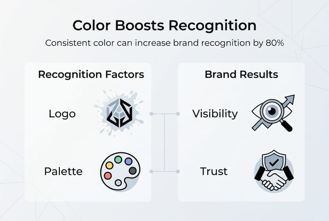
The numbers back this up. Color boosts brand recognition by up to 80% and drives 85% of snap purchase decisions. That means your palette is doing more selling than your sales copy in many cases.
“Color is the first thing people notice and the last thing they forget. It is the silent ambassador of your brand.”
Think about Coca-Cola. You can spot that red from across a parking lot without reading a single word. Tiffany & Co. owns a specific shade of blue so completely that the color itself signals luxury and occasion. These brands invested in color as a core asset, not an afterthought.
Here is what color does that your logo, name, or slogan simply cannot do as fast:
Triggers an emotional response in milliseconds
Signals industry, quality, and personality before any text is read
Creates instant recall across every touchpoint from packaging to social media
Differentiates you on a crowded shelf or search results page
Understanding the visual branding process means treating color as a strategic layer, not a cosmetic one. And when you pair smart logo strategy insights with intentional color choices, your brand becomes genuinely hard to forget. Explore brand color choices to see how leading brands structure their palettes.
Color psychology: how colors shape perception
Every color carries a psychological payload. When you choose blue for your brand, you are not just picking a shade. You are borrowing decades of cultural and emotional association that your customers already carry.
Blue signals trust and stability, which is why banks, tech companies, and healthcare brands lean on it heavily. Red communicates urgency, energy, and appetite, making it a favorite in food and retail. Green connects to health, growth, and sustainability. Orange feels friendly and affordable. Purple suggests creativity and premium quality. Black conveys sophistication and authority.
Here is a quick breakdown of how core colors perform across industries:
Color | Core associations | Common industries |
Blue | Trust, stability, calm | Finance, tech, healthcare |
Red | Energy, urgency, passion | Food, retail, entertainment |
Green | Health, growth, nature | Wellness, food, finance |
Orange | Friendly, affordable, bold | Retail, food, startups |
Purple | Luxury, creativity, wisdom | Beauty, education, premium |
Black | Authority, elegance, power | Fashion, tech, luxury |
Yellow | Optimism, warmth, clarity | Food, kids, retail |
A striking 84.7% of consumers cite color as a primary reason for buying a product. That is not a marginal influence. That is a deciding factor. Your brand archetype should directly inform your color direction, since a “Caregiver” brand and a “Rebel” brand should never share the same palette.
Pro Tip: Do not assume your personal color preferences match your audience’s. Survey real customers or run a quick poll on social media asking which of two color options feels more trustworthy or exciting for your brand. The answer may surprise you.
For deeper guidance on applying color to your digital presence, the website color schemes guide from Elementor is a practical reference.
Building a strategic brand color palette
Knowing what colors mean is only half the job. The other half is building a palette that works as a system, not just a collection of pretty shades.
Follow these steps to build a palette with purpose:
Define your brand personality. Write down five adjectives that describe your brand. Bold, trustworthy, playful, premium, innovative. These words are your filter for every color decision.
Map adjectives to color psychology. Cross-reference your five words with the color associations in the table above. If “trustworthy” and “innovative” are both on your list, blue and a clean accent color like orange or teal may be your starting point.
Audit your competitors. Look at the top five brands in your category. What colors dominate? You want to be recognizable within your industry while standing out from direct competitors.
Choose 2 to 4 colors. A strong palette typically includes a dominant color (60% of usage), a secondary color (30%), a neutral, and an accent (10%). This is the 60-30-10 rule in practice.
Test across all touchpoints. Apply your palette to a mock business card, website header, and social media post before committing. Colors behave differently on screens versus print.
Using 2 to 4 strategic colors, differentiating from competitors, and maintaining consistency across all touchpoints is the proven formula for a palette that builds equity over time.
Consistency is where most brands lose the game. A palette applied inconsistently across platforms confuses customers and erodes the recognition you are working to build. Visual consistency across every brand asset is what turns a color choice into a brand asset.

Pro Tip: Always check color contrast ratios before finalizing your palette. A beautiful palette that fails accessibility standards will exclude a significant portion of your audience and hurt your digital performance.
If you are launching a new brand or rethinking an existing one, reviewing branding strategies for 2026 and the brand refresh guide will give you a broader framework to work within.
Stat to remember: Consistent brand presentation across all platforms increases revenue by up to 23%. Color is the fastest path to that consistency.
Nuances and pitfalls: cultural meaning, contrast, and accessibility
Here is where most brands stumble. They choose a color that performs beautifully in one market and then expand globally without realizing the meaning has completely shifted.
White signals purity and weddings in the United States. In many Asian cultures, it is the color of mourning. Red means danger or debt in some Western contexts, but in China it signals luck, prosperity, and celebration. Purple is associated with royalty in the West but can signal death or mourning in parts of Latin America. Color perception varies dramatically across cultures, and ignoring that is a costly mistake.
Here is a comparison of how two common brand colors read across different cultural contexts:
Color | Western meaning | Eastern/Asian meaning | Risk level |
White | Purity, clean, minimal | Mourning, death | High for global brands |
Red | Urgency, danger, passion | Luck, prosperity, celebration | Medium |
Green | Nature, health, go | Infidelity (some regions) | Low to medium |
Purple | Luxury, creativity | Mourning (parts of Latin America) | Medium |
Beyond culture, contrast is the most overlooked technical factor in color strategy. Many brands choose colors that look great together but fail the WCAG 4.5:1 contrast ratio standard required for accessibility. Low contrast between text and background makes your content unreadable for people with visual impairments and can hurt your SEO performance.
"No universal best color exists; meaning shifts with context, culture, and saturation. Desaturated palettes consistently enhance the perception of luxury."
Saturation also matters more than most brands realize. Highly saturated colors feel energetic and affordable. Muted, desaturated tones feel premium and refined. If you are positioning your brand as a luxury offering, a neon palette will undermine that message regardless of which colors you choose.
Common pitfalls to avoid:
Using too many colors and creating visual noise instead of clarity
Choosing colors based on personal preference rather than audience research
Ignoring how colors render on different screens and in print
Failing to test your palette with diverse audience segments
Overlooking accessibility contrast requirements for digital assets
A modern branding strategy accounts for all of these variables from the start, not as an afterthought.
Applying color effectively: testing, adaptation, and next steps
Theory is only useful when it leads to action. The brands that win with color are the ones that test relentlessly and adapt without losing their core identity.
Here is a practical process for implementing and refining your color strategy:
Start with a hypothesis. Based on your brand personality and color psychology research, choose a primary palette and document why each color was selected.
A/B test your calls-to-action. Test CTA button colors against each other on your website or in email campaigns. Even a single color swap on a button can shift conversion rates by double digits.
Audit contrast and accessibility. Run every color combination through a contrast checker before publishing. Aim for a minimum 4.5:1 ratio for body text.
Adapt for new markets. Before entering a new geographic or demographic market, research local color associations and adjust accent colors or secondary palette elements as needed.
Review your palette annually. Color trends shift. What felt fresh in 2023 may feel dated in 2026. Schedule a yearly brand color review to ensure your palette still reflects your positioning.
Quick stat: Brands that maintain visual consistency across all channels see up to 3.5 times greater brand visibility than those that do not. Color consistency is the single fastest lever you can pull to get there.
Testing is not a sign of uncertainty. It is a sign of professionalism. No color theory book can tell you exactly how your specific audience will respond to your specific palette in your specific market. Only real data can do that.
Take your brand colors to the next level
Building a color strategy that actually works takes more than a color wheel and a gut feeling. It takes research, testing, and professional execution across every brand asset.
At LOOM Brand Designs, we help business owners and marketers build color systems that are grounded in psychology, tested for real-world performance, and applied consistently across every touchpoint. Whether you are starting from scratch with our basic branding package or ready for a full identity overhaul with our standard branding package, we bring the expertise to make your colors work as hard as your business does. Our website design experts also ensure your palette translates perfectly into your digital presence. Book a consultation and let us build a color strategy your customers will never forget.
Frequently asked questions
How do I choose the best color for my brand?
Start by defining your brand personality with five descriptive adjectives, then map those words to color psychology associations and validate your choices with real audience feedback.
Does color really affect sales and recognition?
Absolutely. Color increases brand recognition by up to 80% and directly influences 85% of snap purchase decisions, making it one of the highest-impact branding investments you can make.
Is there a universal best color for branding?
No. Color meanings shift with culture, context, and audience, so what works brilliantly for one brand can backfire for another. Testing with your specific audience is always essential.
What is the 60-30-10 rule in color palettes?
The 60-30-10 rule means allocating 60% of your visual space to your dominant color, 30% to your secondary color, and 10% to your accent color for a balanced and professional look.
Recommended
Comments