


Minimalism in Web Design: A Practical 2026 Guide
- Pawan Samarakoon
- a few seconds ago
- 8 min read

TL;DR:
Minimalism in web design involves removing unnecessary elements to improve user focus and aesthetic clarity. It reduces cognitive load, speeds up task completion, and builds perceived brand trust. Effective minimalist design relies on user research, ongoing discipline, and strategic use of whitespace and hierarchy.
Minimalism in web design is the deliberate reduction of visual and functional elements to only those necessary for effective user interaction and aesthetic clarity. Known formally as reductive design in UX practice, minimalism strips away decorative noise so users can focus on what matters. The approach draws directly from cognitive psychology, specifically from principles like Nielsen Norman Group’s usability heuristics, which prioritize clarity and efficiency over decoration. When applied correctly, minimalist web design reduces cognitive load, speeds up task completion, and builds immediate trust with visitors. This guide covers the core principles, evidence-based benefits, and practical techniques every web designer and digital marketer needs to apply minimalism effectively.

What is minimalism in web design, and what are its core principles?
Minimalist web design is built on six foundational principles that work together to create focused, efficient interfaces.
Simplicity through removal. Every element on the page must earn its place. If a button, image, or text block does not directly serve the user’s primary task, it gets cut. This is not about making things look sparse. It is about removing friction.
Whitespace as a functional tool. Whitespace is not empty space. It is an active design element that groups related content, separates unrelated items, and reduces cognitive strain. Designers who treat whitespace as wasted real estate consistently produce cluttered, harder-to-scan pages.
Clear visual hierarchy. Typography size, weight, and color contrast guide the user’s eye in a deliberate sequence. A well-structured heading scale tells users what to read first, second, and third without any instruction.
Progressive disclosure. Complex workflows stay hidden until the user needs them. Accordions, “show more” links, and layered navigation reveal options on demand rather than dumping everything on screen at once.
One primary action per screen. Each page or view should push the user toward a single goal. Multiple competing calls to action split attention and reduce conversion.
Restrained color and iconography. A limited palette of two to three colors, combined with purposeful icons, keeps the visual system coherent and prevents distraction.
Pro Tip: Before finalizing any page layout, list every element and write one sentence explaining why it stays. If you cannot justify it, remove it.
How does minimalism improve usability and user task performance?
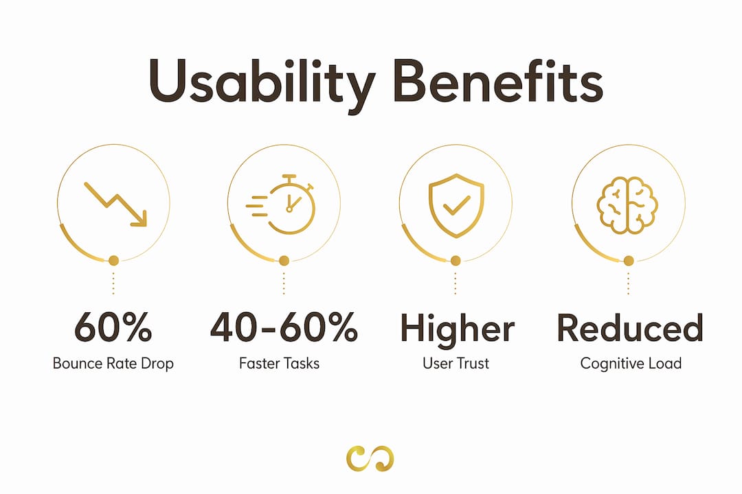
The performance gains from minimalist design are measurable, not just aesthetic. Users complete tasks 40–60% faster on minimalist interfaces compared to cluttered ones. That gap exists because fewer visual elements mean fewer decisions the brain must process before acting.
“Minimalist design reduces the number of stimuli competing for user attention, which directly lowers cognitive load and accelerates decision-making. The result is faster task completion, fewer errors, and higher reported satisfaction.”
Cognitive load theory explains why this works. When a screen presents too many elements simultaneously, working memory fills up before the user reaches the action they came to take. A minimalist layout keeps working memory free for the actual task. This is why perceived usability scores are consistently higher on visually clean interfaces, even when the underlying functionality is identical to a busier design.
The business metrics follow the same pattern. Minimalist sites reduce bounce rates by up to 60% and increase user engagement by 30% compared to cluttered interfaces. Lower bounce rates signal that visitors find what they need quickly and stay to act on it.
One important caveat applies here. Minimalism can harm usability when designers remove essential visual cues along with the clutter. Stripping out borders, hover states, or iconography without replacing them with whitespace and typographic hierarchy leaves users without the feedback they need to navigate confidently. The goal is clarity, not emptiness.
What techniques implement minimalism without sacrificing functionality?
Applying minimalist web design principles in practice requires specific techniques, not just a preference for clean aesthetics. The following steps give you a repeatable process.
Audit every element. Start with a full inventory of your current page. Categorize each element as essential, supporting, or decorative. Remove the decorative category entirely and evaluate the supporting category against user task data.
Use whitespace for grouping instead of borders. Borders and dividers add visual weight. Generous spacing between content blocks communicates separation just as clearly, with less noise. Whitespace improves comprehension by up to 20% on mobile screens, where space is already limited.
Build a typographic scale. Choose three type sizes: a heading, a subheading, and body text. Apply them consistently. Use font weight (regular vs. bold) to create emphasis within those three levels rather than adding more size variations.
Apply progressive disclosure. Move secondary options into accordions, tooltips, or secondary screens. Progressive disclosure preserves full functionality while keeping the primary interface clean. Users who need advanced features will find them. Users who do not will never see them.
Limit your color palette. Choose one primary action color, one neutral background, and one text color. Add a single accent for alerts or highlights. More than four colors in a UI almost always signals a design that needs editing.
Design mobile-first. Mobile constraints force the prioritization decisions that minimalism requires. If a feature cannot fit cleanly on a 375px screen, question whether it belongs on the desktop version at all.
Check contrast for accessibility. WCAG 2.1 requires a minimum contrast ratio of 4.5:1 for normal text. Minimalist designs that rely on light gray text on white backgrounds frequently fail this standard. Clarity and accessibility are the same goal.
Pro Tip: Run your design through Hick’s Law before launch. Count the number of choices on each screen. Every additional option increases decision time. Fewer choices produce faster, more confident users.
Technique | Primary benefit | Common mistake |
Whitespace grouping | Reduces visual noise | Using too little, reverting to borders |
Typographic scale | Guides scanning | Adding too many size variations |
Progressive disclosure | Preserves functionality | Hiding critical primary actions |
Limited color palette | Maintains coherence | Using accent color for too many elements |
Mobile-first layout | Forces content prioritization | Designing desktop first, then stripping down |
What do examples of minimalistic web design reveal about brand perception?
Minimalism does more than improve usability. It shapes how visitors perceive a brand before they read a single word. Aesthetic minimalism increases perceived trust and professionalism, which means a clean design communicates competence even to users who cannot articulate why they trust a site.
The mechanism is straightforward. A cluttered page signals effort without direction. A clean page signals confidence and control. Visitors interpret visual restraint as a sign that the brand knows exactly what it offers and who it serves.
Several patterns appear consistently in well-executed minimalist branding and web work:
Typography as the primary visual statement. When a brand removes decorative imagery, its typeface carries the full weight of personality. A well-chosen serif communicates authority. A geometric sans-serif communicates precision. The choice cannot be arbitrary.
Photography used sparingly and purposefully. One strong, high-resolution image outperforms a grid of six average ones. Minimalist sites treat photography as punctuation, not wallpaper.
Consistent negative space across breakpoints. Brands that maintain their whitespace ratios from desktop to mobile feel cohesive. Those that collapse spacing on smaller screens lose the premium feel they built on larger ones.
Color as a signal, not decoration. A single brand color applied only to interactive elements teaches users quickly where to click. Overusing that color dilutes the signal.
For digital marketers, the implication is direct. Minimalist design in campaign landing pages removes the visual competition that pulls attention away from the conversion action. A page built around visual clarity and engagement consistently outperforms one that tries to communicate everything at once. Loombranddesigns applies these principles across branding and web projects, with results visible in its design portfolio.
Key Takeaways
Minimalism in web design is the most evidence-backed method for reducing cognitive load, accelerating task completion, and building brand trust simultaneously.
Point | Details |
Speed through simplicity | Minimalist interfaces produce 40–60% faster task completion by reducing cognitive load. |
Whitespace is functional | Generous whitespace improves mobile comprehension by up to 20% and replaces borders effectively. |
Progressive disclosure preserves depth | Accordions and layered navigation keep interfaces clean without removing advanced functionality. |
Minimalism builds brand trust | Clean aesthetics increase perceived professionalism before users read any content. |
Accessibility and clarity align | WCAG 2.1 contrast standards and minimalist readability goals point in the same direction. |
Why minimalism is harder than it looks
Most designers I work with approach minimalism as a subtraction exercise. They take an existing design and start deleting things. That process almost always produces a broken interface, not a clean one. Real minimalist design requires you to rebuild from the user’s primary task outward, adding only what that task demands.
The discipline comes from user research, not aesthetic preference. Before removing any element, you need data. Heatmaps, session recordings, and task completion tests tell you what users actually use versus what you assumed they would use. Without that evidence, you are guessing, and guessing in the direction of “less” is just as dangerous as guessing in the direction of “more.”
The other mistake I see constantly is treating minimalism as a finished state. A clean design in january can become cluttered by march if new features get added without the same editorial discipline that built the original. Minimalism requires ongoing governance. Someone on the team needs to own the question of whether each new element earns its place, every single sprint.
The effective website design principles that produce long-term results treat whitespace and simplicity as active tools, not defaults. The best minimalist sites feel effortless to use precisely because enormous effort went into deciding what to leave out.
— Pawan
How Loombranddesigns builds minimalist web experiences
Loombranddesigns specializes in website design and development that applies minimalist principles from the first wireframe to the final launch. Every project starts with a content audit and user task analysis, so design decisions are grounded in evidence rather than trend.

The team at Loombranddesigns also integrates minimalist thinking into branding packages, ensuring that your visual identity and your web presence speak the same language. Clean typography, purposeful color, and structured whitespace carry through from logo to landing page. If you want a site that loads fast, converts confidently, and builds trust on first impression, the standard branding package is a strong starting point for businesses ready to commit to clarity.
FAQ
What is minimalism in web design?
Minimalism in web design is the practice of using only the elements necessary for effective user interaction, removing decorative or redundant components to reduce cognitive load and improve task completion speed.
What are the main benefits of minimalism in web design?
Minimalist designs produce faster task completion, lower bounce rates, and higher perceived trust. Research shows users complete tasks 40–60% faster on minimalist interfaces compared to cluttered ones.
How does whitespace function in minimalist design?
Whitespace groups related content, separates unrelated elements, and reduces cognitive strain. It is a structural tool, not empty space, and improves mobile comprehension by up to 20%.
Can minimalism hurt usability?
Yes. Removing essential visual cues like borders, hover states, or icons without replacing them with whitespace and typographic hierarchy leaves users without the feedback they need to navigate. Minimalism requires replacing visual noise with structure, not simply deleting elements.
How do I start implementing minimalist web design principles?
Start with a full element audit. Categorize every component as essential, supporting, or decorative, then remove the decorative layer entirely. Use progressive disclosure to handle complexity, and validate every removal with user testing data before publishing.
Recommended